FAQ
Why a new brand now?
- The previous Autism Society brand is over 20 years old and no longer serves the needs of the community. It lacked important visual and written components that clearly demonstrate our organization’s values of inclusivity, connection, and acceptance. The brand did not center the Autism community anymore.
- Autistic self-advocates identified their lack of inclusion in decision-making within Autism organizations as a major hurdle for their engagement with those organizations. The Autism Society has heard from many individuals and groups that the organization’s previous brand did not resonate with or serve the community effectively. We listened.
- From the beginning of the rebrand process, the Autism Society set out to create a space that was fully inclusive, accepting, and representative of all those in the Autism community.
- This Brand was designed with the Autism community and is an expression of the community.
Where is the puzzle piece? Why have you moved away from that logo element?
- The puzzle piece was a part of the old Autism Society logo, but not exclusively. In fact, the puzzle piece transcends identification with one single organization. It is no longer an effective brand mark for our organization because it is too ubiquitous.
- We aim to value people’s experiences as individuals. We know that the puzzle piece means a lot for some people, while it does not for others. The shift away from using the puzzle piece to interconnected threads is a recognition of the diversity of experiences and connection points within the community.
- We’ve heard that the puzzle piece is limiting for many in the community. Autistic individuals have said, “I am not a puzzle to be solved.” We are making a conscious decision to hear those voices and reflect them in our new logo.
- The puzzle has been part of the history of Autism in general, including in the brands and logos of several Autism-focused organizations. That history is a part of the Autism community’s story, and that of many individuals for whom the image resonates. We also have to decide what our future looks like. The Autism Society is choosing a future that connects, accepts and includes everyone in the Autism community through the new brand mark that features interconnected threads.
- No matter how you feel connected to Autism, you are connected. The images that help you as an individual feel connected are valid. The Autism Society embraces you as the connection.
- The representation of the puzzle piece has evolved since its earlier inception, and in recent years the Autism Society has not used the puzzle piece in marketing materials, messaging or network-wide campaigns. Like our efforts to shift April from Autism Awareness Month to Autism Acceptance Month, as well as our rebranding, words and representation matters, and we must evolve alongside our community.
What does this brand mean to members of the Autism community?
- By centering Autistic individuals and their loved ones, the brand amplifies the power of neurodivergent voices and needs in advocating for inclusive policies and fosters acceptance through visibility. The new brand demonstrates the ongoing commitment from the Autism Society to continue to listen, learn, and to weave together the thoughts, ideas, and concerns of all its community members to better serve Autistic individuals and their loved ones.
- Across the Autism community, which includes families, caretakers, and friends, the brand invites everyone to be the connection, which fosters acceptance, inclusion, and support of Autistic individuals so that they may live fully.
How did inclusivity work in the design process?
- Inclusivity has been an essential component, not only to the design process, but at every step of the project. Specifically for the design process, an in-depth examination was undertaken to ensure equitable access to content, so the Autism community could easily access information without visual, auditory or other sensory barriers. Design elements were presented and reviewed by 150 individuals representing the key groups within the Autism community: Autistic individuals across the spectrum, families and caregivers, and professionals in the Autism field all participated in the process.
Explain the logo. What does it mean? Why did you choose this logo?
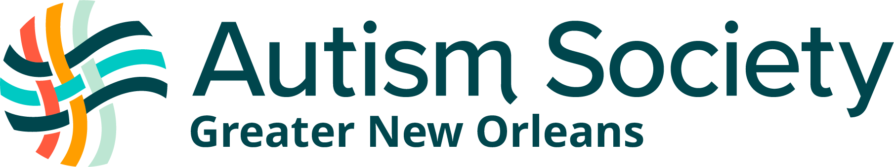
- The mark is a symbol for community, strength, equity, diversity, pathways and, of course, connection. The single threads of the Autism Society brand mark represent individuality and unique experiences that are simultaneously interconnected and woven to the greater community. The mark speaks to the interdependence of the Autism community.
- In Watson’s strategy work, they identified three key groups, or personas, that form the community the Autism Society works with, reaches out to, or partners with. They are the Champions – those caring for loved ones with Autism, the Firebrands – those making change happen for the Autism community and the Agents. They each have a different role and approach to working with and being involved with the Autism community.
- Each color and band in the logo represents one of these groups, and the weave pattern symbolizes the groups coming together, working together and the intersections of their respective skills, goals and talents. There are also two horizontal threads that have the same color, which represents equality.
- Additionally, the individual threads that make up the pattern, when working together or when “woven” together, create a stronger, more resilient “fabric” of people working together for the Autism community.
Explain the colors, photos, or other visual elements of the brand.
There are 4 main elements to the Autism Society brand.
Colors
- The brand colors bring a vibrant and inclusive feeling to the Autism community. We made sure to have a balance of softer tones and brighter pops, which gives us a wide range of color combinations to work with.
- All colors were put through Web Content Accessibility Guidelines (WCAG) tests to ensure legibility and useability for as many people as possible, when the colors are used in text.
Threads
- The thread elements represent people within the Autism community. While being a part of a community, they are still individuals. This ensures there is a graphic element that helps recognize that individual experiences are respected and unique, even if they are associated with the Autism community.
- The woven threads represent the intersectionality of all those in the Autism community. This includes the full-spectrum of people with Autism, their families, caretakers, professionals in the field and others who are connected.
- Each thread has its own pattern and color that further expresses the individual it is paired with, when used with our photography.
Waves
- The wave elements help ground the threads, providing a soothing and fluid look and feel to any design. This keeps in mind that all graphic elements should not be too overwhelming, busy or distracting for people interacting with the brand.
Photography
- The look and feel of the Autism Society’s photography was carefully thought through to ensure that all portraits feel approachable and authentic. Capturing individuals within the Autism community was key to portray this authenticity and diversity. The individuals featured in the photos were included in photo shoot discussions to ensure they were comfortable and supported while having their portrait taken.
- The photo style includes soft shadows that feel calming, grounded, and welcoming rather than harsh or unapproachable.
Why is Autism capitalized in all instances?
- It is a visual shift from understanding Autism solely as a disorder or diagnosis to a broader understanding of Autism as a culture and diverse neurotype as well.
- The Autism Society believes the shift to a capital A is a broader representation of a culture, identity and diverse neurotype – as well as the disorder itself. It can improve understanding of the diverse needs and perspectives within the Autism community, leading to increased access, inclusion, and meaningful support for people with Autism and their loved ones in our society.
- Whether you ascribe to “person-first” or “identity-first,” Autism is a culture, a community, a lived experience. Capitalizing Autism addresses it as such.
Explain ‘person-first’ and ‘identity-first’ and what that means as I read/listen to content from the Autism Society.
- Across conversations in the Autistic community (people with Autism), there are preferences for use of person-first identification (Person with Autism) or identity-first identification (Autistic Person).
- Because Autism and the experiences of living with Autism are myriad and unique, and individuals who self-advocate have preferences about how to describe their identity, we always recommend asking an individual what their preference is.
- In the Autism Society’s new brand, to honor and recognize that both identifiers are valid for individuals, our practice is to start written materials with person-first language, and use identity-first language as a secondary reference after the opening use.
Explain the new tagline: The Connection is You ™
- The tagline exemplifies the Autism Society’s vision—creating a world where everyone in the Autism community is connected to the support they need, when they need it. And by everyone, it means every unique individual: the implacable, inimitable, and irreplaceable, and infinite you.
- Furthermore, it is a call to action for anyone to BE the connection. It could be someone connecting to services, or sharing information, or providing support. We are all a part of the community, when we all act as the connection.
This brand doesn’t represent me. How can you say that it is representative of the community?
- Paul Rand, one of the most prolific and respected logo & brand designers, said it this way:
- “Ideally [logos] do not illustrate but indicate…they do not represent but suggest…and are stated with brevity and wit. Finally, [brands are] created by designers but made by the company.”
- “Brands” are not designed to define or represent individual or specific people or organizations. Instead, brands are defined by the organization and the people they represent. They are symbols, colors, styles that come to represent the work and the people that are doing the work, not the other way around. Each member of the Autism Society community will define how the new brand stands for the work and the mission of the organization.
- The brand development process included representatives from all facets of the Autism community, and the creative results were selected based on majority input. Like anything, individuals respond to certain colors, designs, and interpretations differently. We are proud of our inclusive development process and
I’ve seen logos that look similar. How is this original?
- The Autism Society and its work for the Autism community will define what the logo stands for. There are always similar designs, especially in the world of logos. What will make the Autism Society logo stand out and stand apart is the work of the Autism Society and the Autism community it represents. That is what will define the brand and the logo. As the equity of the brand grows, it will be unmistakable as the Autism Society mark.
- The brand also had to serve as an accessible space welcome to all. To do so, it was designed to eliminate structural barriers to resources and information, and to create inclusive practices that support the diverse needs of the Autism community.
- The Watson team reviewed all colors, fonts and shapes using the Web Content Accessibility Guidelines (WCAG) to ensure that any individual engaging with the Autism Society and those seeking resources could easily access information without visual, auditory or other sensory barriers. Individuals, families and professionals were consulted throughout the process to test and measure the impact of each design choice along the way.